U.S. Pollution Data by State, a Visualization Analysis
This blog post was published in Analytics Vidhya.
I’m focusing on finding the major pollutant by state, and looking for a trend if possible. This project is important because it helps us to look at each of the four pollutants in detail and understand the effects that pollution has on each state. To present the data, my method is to incorporate graphs and charts including pie charts, bar charts, maps, and scatter plots. My goal is to dig deeper into the cause and effect of pollution and we expect to find a possible trend of major pollutants by state.
Since my dataset has features that contain the amount of emissions of different gases we can create bar graphs to see which State has the highest amount of emissions of each gas. We can use pie charts to see the percentages of gases by State. We also can use boxplots for all the pollution gas emissions. Since we have categorical data, states, we can use bar graphs for these features. Finally, we can do a map graph to see different pollutant gases level in each state.
Dataset:
My data “U.S. Pollution Data: Pollution in the U.S. since 2000” can be found in Kaggle.(https://www.kaggle.com/sogun3/uspollution) We have a total of 1746661 entries and 29 features.
Visualizations:
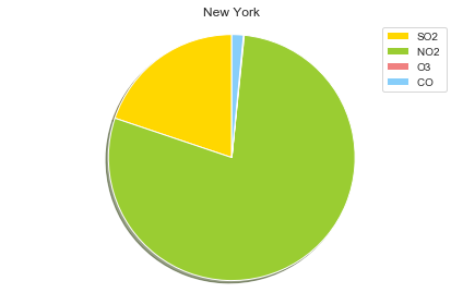
This figure shows that the gas with the highest % in NYC is NO2. The emission for O3 is very low. It cannot be seen in this graph.
2000 Year Plots:

This figure shows that Louisiana has a higher amount of NO2 gas emissions during the 2000 year. Kansas has a lower amount of NO2 emissions during the 2000 year.

This figure shows that the New Jersey has a higher amount of SO2 gas emissions during the 2000 year. Florida has a lower amount of SO2 emissions during the 2000 year.

This figure shows that Kansas has a higher amount of O3 gas emissions during the 2000 year. Pennsylvania has a lower amount of O3 emissions during the 2000 year.

This figure shows that the District of Columbia has a higher amount of CO gas emissions during the 2000 year. California followed by New York has a lower amount of CO emissions during the 2000 year.
2016 Year Plots:

This figure shows that Colorado has a higher amount of CO gas emissions during the 2016 year. Pennsylvania has a lower amount of CO emissions during the 2016 year.
This figure shows that Colorado has a higher amount of SO2 gas emissions during the 2016 year. Louisiana and Wyoming a lower amount of SO2 emissions during the 2016 year.

This figure shows that Utah has a higher amount of NO2 gas emissions during the 2016 year. New Hampshire has a lower amount of NO2 emissions during the 2016 year.
This figure shows that Wyoming has a higher amount of O3 gas emissions during the 2016 year. Washington has a lower amount of O3 emissions during the 2016 year.
Heat Maps:

Map that shows the emissions of NO2 by State. Higher emission of NO2 is found in New York, New Jersey, Arizona and Colorado.
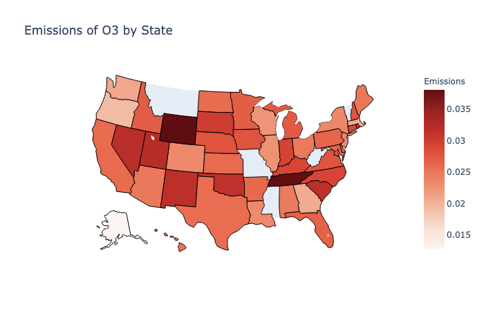
Map that shows the emissions of O3 by State. Higher emission of O3 is found in Wyoming and Tennessee.
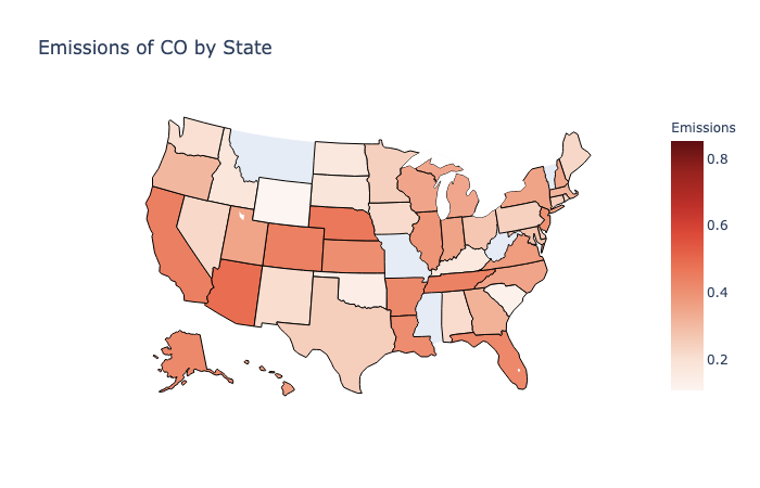
Map that shows the emissions of CO by State. The higher emission of CO is found in Florida and Arizona.
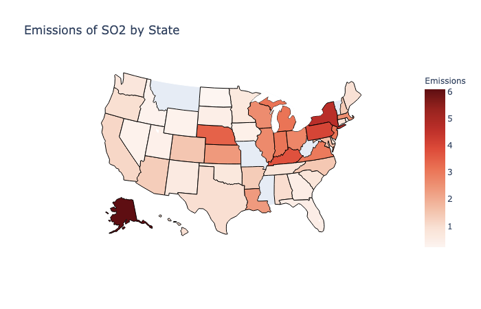
Map that shows the emissions of SO2 by State. The higher emission of SO2 can be found in New York. The minimum value for gas emission can be found in Wyoming.
Discussion/Limitation:
From the data, I can see that there are higher levels of gas emissions in states with higher urban activities. New York state emits the highest level of both NO2 and SO2 gas, I can assume that this is due to the state’s high urban activities and population. Florida and Arizona score high in CO emission and Wyoming and Tennessee in O3 emission. To better understand the causes of these results and to back up my hypothesis, I need data on state population counts, urban and rural activities.
Conclusion & Future Work:
From this analysis, I confident identified which States had higher amount of gas emissions in different years.
In my future work, I can incorporate demographic dates from cities and states, including population and demographic activities, to see if there are potential correlation or causation between gas emission and the factors stated above. I also would like to add more data to other countries so I could do our visualization globally. In addition, I would like to do my project including all cities and counties in the USA.
Github Repo: